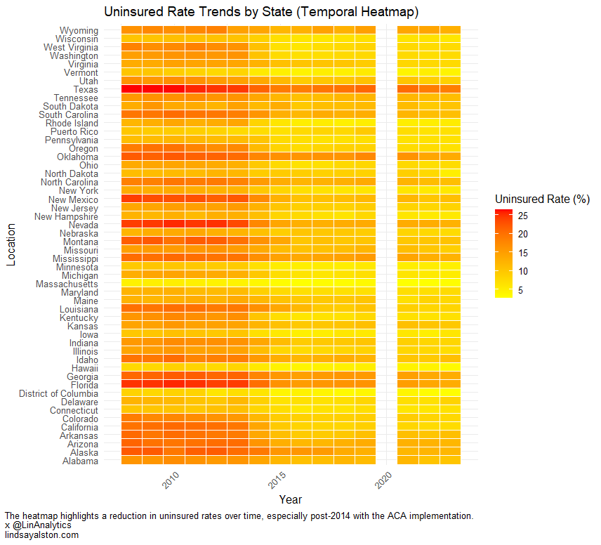
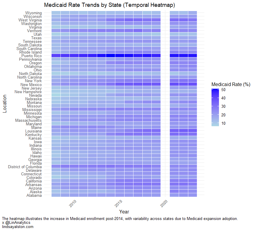
The two temporal heatmaps, showcasing trends in uninsured rates and Medicaid enrollment rates across states, highlight significant differences in health insurance coverage patterns over time.

The Uninsured Rate heatmap reveals a steady decline in uninsured populations across most states, with noticeable improvements starting around 2014, coinciding with the implementation of the Affordable Care Act (ACA). States like Texas and Florida consistently exhibit higher uninsured rates throughout the observed period, while states such as Massachusetts and Vermont maintain significantly lower rates, reflecting regional disparities in healthcare access and policy implementation.

In contrast, the Medicaid Rate heatmap underscores the impact of Medicaid expansion under the ACA. Many states, particularly in the Midwest and Southeast, display increasing Medicaid coverage over time, as represented by darker blue shades. States like West Virginia and Kentucky show substantial growth in Medicaid enrollment, while states such as Texas, which opted out of Medicaid expansion, exhibit relatively lower enrollment rates. The differences between the two heatmaps underscore how state-level decisions regarding Medicaid expansion influence health insurance trends.
Together, these heatmaps paint a compelling picture of the ACA’s impact. While the uninsured rate dropped significantly across most states, the increase in Medicaid coverage is uneven, reflecting the varied adoption of Medicaid expansion. This comparison highlights the interplay between federal policies and state-level decisions, showcasing both progress and persistent gaps in health insurance coverage across the United States.