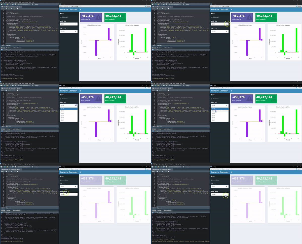
Imagine a dashboard that breathes life into raw data, transforming it into vivid insights. Each piece of code in this R Shiny application weaves together a seamless experience for users, delivering clarity and actionable intelligence from a previously overwhelming dataset.
The Fetching of Data
The magic begins with a call to an API, pulling in raw records from an external source. This data, messy and unorganized, becomes the foundation. The fetch_data() function acts as the gateway, meticulously extracting, decoding, and structuring information into a usable format. With every API response, the function ensures that only valid, structured data reaches the heart of the application.
The User Interface (UI)
The interface is designed with precision, balancing functionality with simplicity. A sidebar allows users to navigate between sections effortlessly, offering options to filter data by year and period. Each tab on the dashboard serves a specific purpose, whether it’s showcasing key performance indicators (KPIs) or diving into detailed visualizations. The interface isn’t just functional; it’s intuitive, guiding users to insights without distraction.
The Engine Room (Server Logic)
Behind the scenes, the server logic is a symphony of reactive programming. Every user interaction triggers a cascade of updates, ensuring the data displayed is always fresh and relevant. Filtering by fiscal year or period becomes effortless, with the application dynamically adjusting outputs.
From calculating total accidents to rendering casualty trends, each value box and plot is a window into the data’s story. The renderValueBox() functions distill complex computations into concise summaries, while the renderPlot() functions craft visual narratives with bars and lines, revealing patterns and anomalies hidden in the numbers.
A Visual Feast
The plots are where the data truly comes alive. Imagine a bar chart depicting accident counts by period, complemented by a trend line that whispers the underlying story of the data. Pie charts, crafted with plotly, break down collision types and severities into digestible proportions. The careful use of colors, labels, and themes ensures these visuals are not just informative but engaging.
Dynamic and Scalable
This dashboard is not a static tool but a dynamic powerhouse. With every dataset filtered, chart rendered, and value calculated, the application demonstrates its ability to scale effortlessly with user demands. Whether handling a small local dataset or large-scale governmental records, it adapts without missing a beat.
The Final Act
As the user navigates through the application, a story unfolds—one of discovery, understanding, and action. The dashboard is more than just a tool; it’s a partner in decision-making, empowering users to move from confusion to clarity with every click.
This is data analytics elevated, where each line of code contributes to a harmonious blend of functionality and user experience. It’s not just about what the data says—it’s about how effortlessly it speaks to you.