1. Experimenting with Forecast Residual Monitoring
Over the past few days, I’ve been experimenting with a simple yet powerful way to possibly keep forecast accuracy honest: using an XmR (individuals – moving range) control chart to monitor forecast residuals in real time. What started as a curiosity—“Can I apply process‐behavior thinking to demand forecasts?”—quickly became a practical tool for spotting bias shifts before they derail your inventory plans or production schedules.
2. Spotting Drift Before It Costs You
This isn’t just theory. If you’re relying on forecasts to guide ordering, staffing, or investment, a gradual drift in your errors can quietly erode margins or inflate costs. Traditional summary metrics (MAPE, RMSE) only tell you how you did after the fact. But if you want to catch emerging problems, you need a chart that watches your residuals as a running process. An XmR chart can quietly flag when your errors are “out of control” or creeping toward the warning zone—so you can adjust your model or investigate root causes right away.
In this post, I’ll break down what I learned from simulating a demand‐forecast scenario in R—complete with an intentional error shift late in the series—and how an XmR chart makes that shift unmistakable.
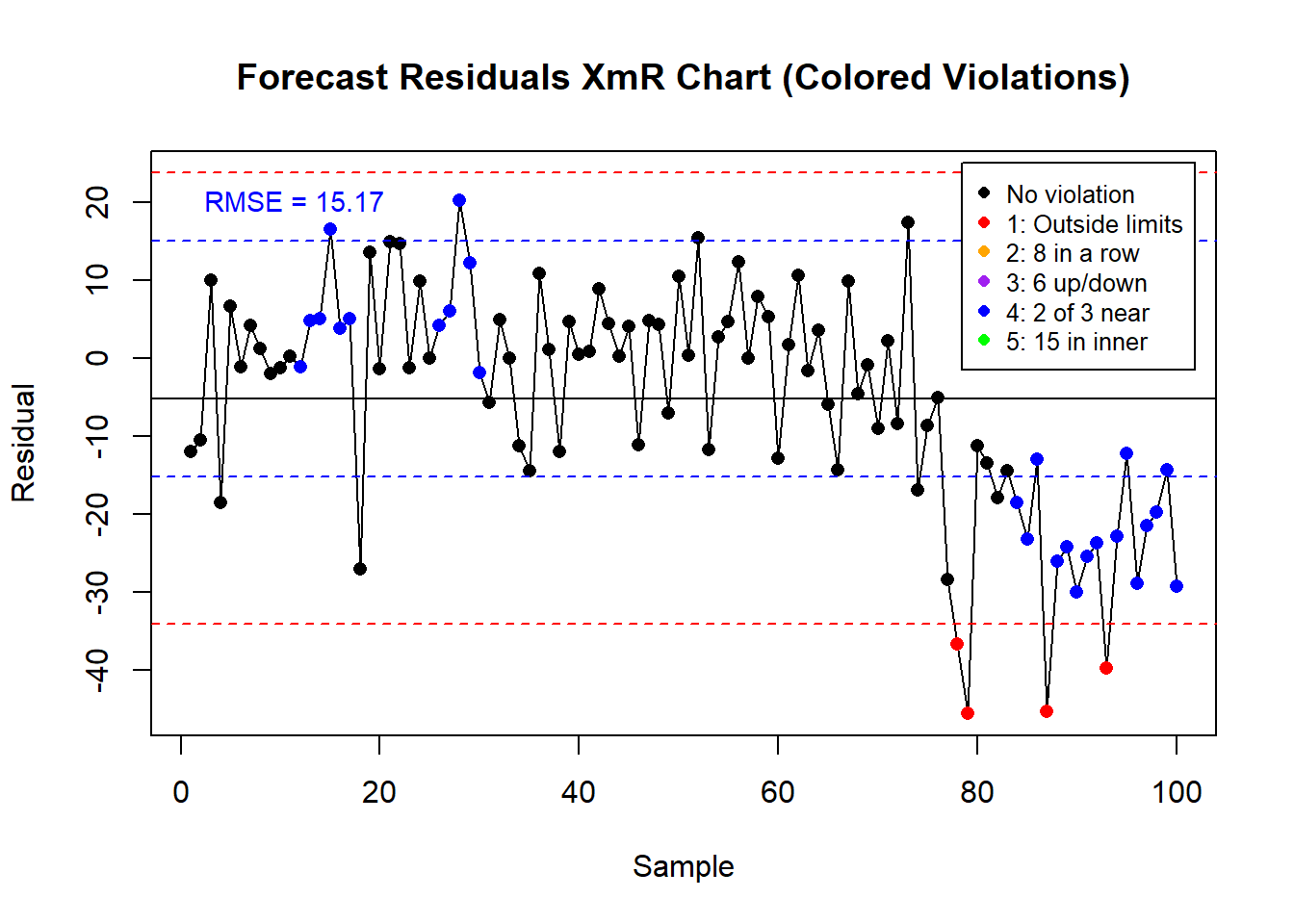
3. XmR Charts as a Live Error Alarm
Monitoring forecast residuals with an XmR chart turns a static error metric into an early-warning system.
Once I plotted the forecast errors on an XmR chart, I couldn’t unsee the moment when my model’s bias crept out of its normal operating range.
For example: I simulated 100 days of demand forecasts with an average error of zero and then introduced a systematic +25-unit bias from day 76 onward. The RMSE of residuals (≈ 15.17) exceeded the chart’s estimated σ (≈ 9.66), yet the pooled summary metric barely moved—masking the shift. In contrast, my XmR chart lit up with violations the moment those biased errors crossed its control limits.
4. Building and Reading Your XmR Chart in R
Code
suppressPackageStartupMessages(library(qcc))set.seed(42)n <-100actual_demand <-rnorm(n, mean =500, sd =20)forecast <- actual_demand +rnorm(n, mean =0, sd =10)forecast[76:100] <- actual_demand[76:100] +rnorm(25, mean =25, sd =10)residuals <- actual_demand - forecastspecific_data <- residuals
Code
# Suppress package startup messagessuppressPackageStartupMessages(library(qcc))# 1. Calculate RMSE and MAPErmse <-sqrt(mean(specific_data^2))mape <-mean(abs(specific_data / actual_demand)) *100# 2. Print metrics to consolecat("RMSE of residuals:", round(rmse, 2), "\n")
RMSE of residuals: 15.17
Code
cat("MAPE of forecast :", round(mape, 2), "%\n\n")
MAPE of forecast : 2.28 %
Code
# 3. Create XmR object without auto-plottingx_mr_chart <-qcc(data = specific_data,type ="xbar.one",plot =FALSE)# 4. Extract chart data and violationsstats <- x_mr_chart$statisticscl <-as.numeric(x_mr_chart$center)ucl <- x_mr_chart$limits[, "UCL"]lcl <- x_mr_chart$limits[, "LCL"]violations <- x_mr_chart$violations# 5. Define colors and short descriptions for rulesrule_colors <-c("1"="red", # Outside limits"2"="orange", # 8 in a row"3"="purple", # 6 up/down"4"="blue", # 2 of 3 near"5"="green"# 15 in inner)rule_desc <-c("1"="Outside limits","2"="8 in a row","3"="6 up/down","4"="2 of 3 near","5"="15 in inner")point_colors <-ifelse(is.na(violations),"black", rule_colors[as.character(violations)])# 6. Plot the Individuals chart with colored pointsplot( stats, type ="o", pch =16,col = point_colors,ylim =c(min(c(lcl, stats)), max(c(ucl, stats))),xlab ="Sample", ylab ="Residual",main ="Forecast Residuals XmR Chart (Colored Violations)")abline(h = cl, col ="black", lty =1)abline(h = ucl, col ="red", lty =2)abline(h = lcl, col ="red", lty =2)# 7. Overlay ±RMSE in blueabline(h = rmse, col ="blue", lty =2)abline(h =-rmse, col ="blue", lty =2)# 8. Label the RMSE on the left side, nudged upwardusr <-par("usr")xpos <- usr[1] +0.05* (usr[2] - usr[1])ypos <- rmse +0.05* (usr[4] - usr[3])text(x = xpos,y = ypos,labels =paste0("RMSE = ", round(rmse, 2)),col ="blue",adj =c(0, 0),cex =0.9)# 9. Add a legend in the top-right, with short violation descriptionslegend("topright",legend =c("No violation",paste(names(rule_desc), rule_desc, sep=": ") ),col =c("black", unname(rule_colors)),pch =16,cex =0.8,inset =c(0.02, 0.02),bg ="white")
Code
# 3. Calculate and print moving rangesmoving_range <-c(NA, abs(diff(specific_data)))cat("Moving Range Values:\n")
# 4. Print chart details and extract violationsprint(x_mr_chart)
-- Quality Control Chart -------------------------

Chart type                 = xbar.one
Data (phase I)             = specific_data
Number of groups           = 100
Group sample size          = 1
Center of group statistics = -5.146691
Standard deviation         = 9.661978

Control limits at nsigmas  = 3
       LCL      UCL
 -34.13262 23.83924
  [1] NA NA NA NA NA NA NA NA NA NA NA  4  4  4  4  4  4 NA NA NA NA NA NA NA NA
 [26]  4  4  4  4  4 NA NA NA NA NA NA NA NA NA NA NA NA NA NA NA NA NA NA NA NA
 [51] NA NA NA NA NA NA NA NA NA NA NA NA NA NA NA NA NA NA NA NA NA NA NA NA NA
 [76] NA NA  1  1 NA NA NA NA  4  4  4  1  4  4  4  4  4  1  4  4  4  4  4  4  4
attr(,"WesternElectricRules")
[1] 1 4
Code
# 5. Summarize violations in plain Englishrule_names <-c(`1`="Point outside limits",`2`="8 in a row on one side",`3`="6 steadily up or down",`4`="2 of 3 near limits",`5`="15 in inner third")cat("\n--- Violation Summary ---\n")
--- Violation Summary ---
Code
idx <-which(!is.na(violations))if (length(idx) ==0) {cat("No rule violations detected.\n")} else {for (i in idx) { rule_code <-as.character(violations[i])cat("Point", i, "violated:", rule_names[rule_code], "\n") }}
Point 12 violated: 2 of 3 near limits
Point 13 violated: 2 of 3 near limits
Point 14 violated: 2 of 3 near limits
Point 15 violated: 2 of 3 near limits
Point 16 violated: 2 of 3 near limits
Point 17 violated: 2 of 3 near limits
Point 26 violated: 2 of 3 near limits
Point 27 violated: 2 of 3 near limits
Point 28 violated: 2 of 3 near limits
Point 29 violated: 2 of 3 near limits
Point 30 violated: 2 of 3 near limits
Point 78 violated: Point outside limits
Point 79 violated: Point outside limits
Point 84 violated: 2 of 3 near limits
Point 85 violated: 2 of 3 near limits
Point 86 violated: 2 of 3 near limits
Point 87 violated: Point outside limits
Point 88 violated: 2 of 3 near limits
Point 89 violated: 2 of 3 near limits
Point 90 violated: 2 of 3 near limits
Point 91 violated: 2 of 3 near limits
Point 92 violated: 2 of 3 near limits
Point 93 violated: Point outside limits
Point 94 violated: 2 of 3 near limits
Point 95 violated: 2 of 3 near limits
Point 96 violated: 2 of 3 near limits
Point 97 violated: 2 of 3 near limits
Point 98 violated: 2 of 3 near limits
Point 99 violated: 2 of 3 near limits
Point 100 violated: 2 of 3 near limits
5. Why Weekly RMSE Isn’t Enough
Now, you might think: “I already track MAPE every week—isn’t that enough?”
And it’s understandable: summary error metrics are familiar and easy to share. But they only tell you how bad things were over a period, not when your process started going off-script. By the time RMSE moves, you’ve often lost days or weeks of suboptimal decisions. The XmR approach gives you that real-time pulse—and calls your attention the moment something drifts.
6. Moving to Automated Alerts and Diagnostics
This idea opens the door to a host of practical questions:
How do you investigate whether a bias shift comes from data collection issues, model drift, or actual changes in customer behavior?
What’s the best way to automate XmR charting within your forecasting pipeline?
How might you extend this approach to group charts (e.g., subgrouping daily by region) for even finer-grained detection?
In the meantime, download the example R script above, run your own XmR chart on your data, and share your insights or questions in the comments.
7. From Static Metrics to Proactive Forecasting
Like I said:
Once you see your forecast errors as a process on an XmR chart, you can’t unsee it. It changes how you interpret what “normal” error looks like—whether you’re planning inventory, staffing service teams, or budgeting spend. A small mental shift—from static metrics to dynamic monitoring—can reshape your forecasting practice from reactive to proactive.
And if you start applying it now, you won’t just catch bias earlier—you’ll build confidence that your forecasts are doing the job you need them to do.