This is a living document. It’s updated regularly. Adapted as conditions, feedback, or understanding changes.
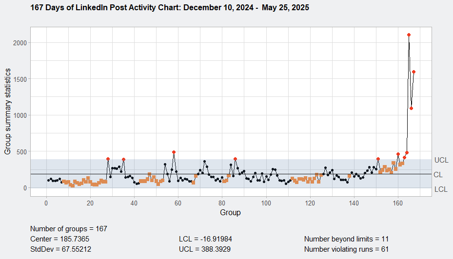
Image 1: Day 146 start of process shift in LinkedIn algorithm.
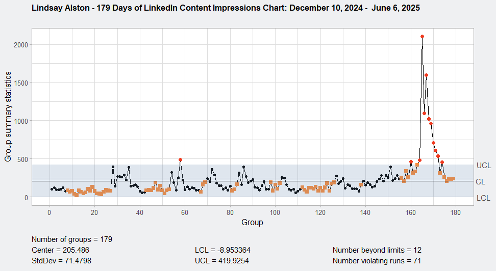
Image 2: First LinkedIn process shift in algorithm confirmed Day 156 (first orange block). Second LinkedIn process shift in algorithm confirmed Day 163 algorithm. Day 164 2107 impressions. My first major viral day.
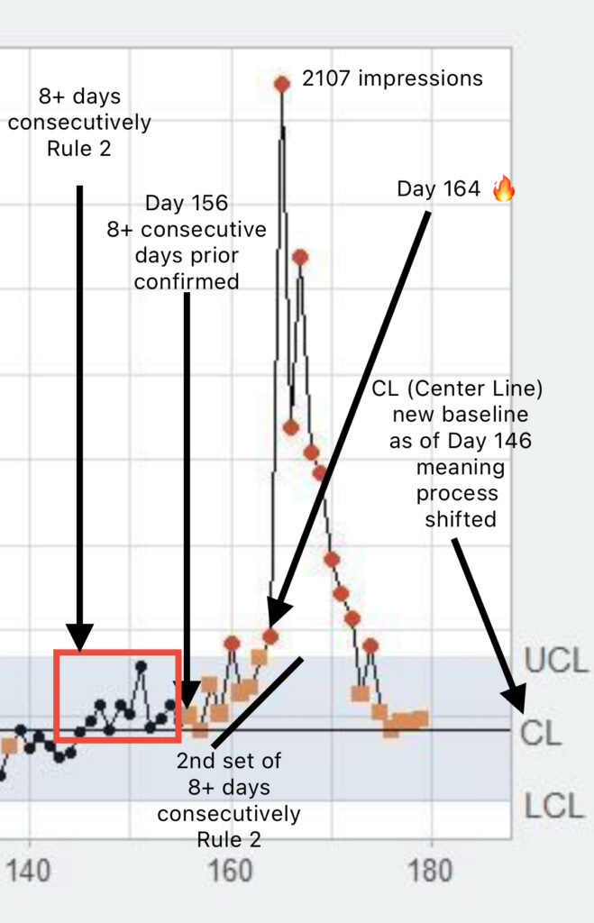
Image 3: Variation Analysis. Explanation of Detection Rule 2: Runs About the Center Line. Eight, nine, ten, successive values, all on the same side of the central line may be interpreted as an indication of an assignable clause which as a weak but sustainable effect. Confirmed Days 156 and 163. (Note: looking at the 8+ consecutive days prior to both days.)
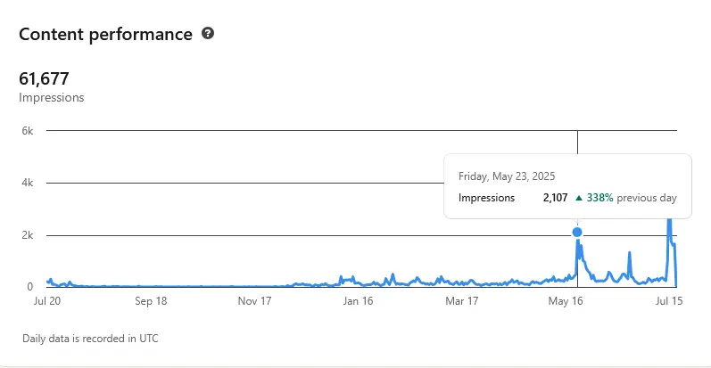
Image 4: Friday, May 23, 2025 – 2107 impressions.
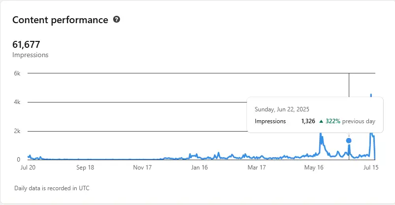
Image 5: Sunday, June 22, 2025 – 1326 impressions.
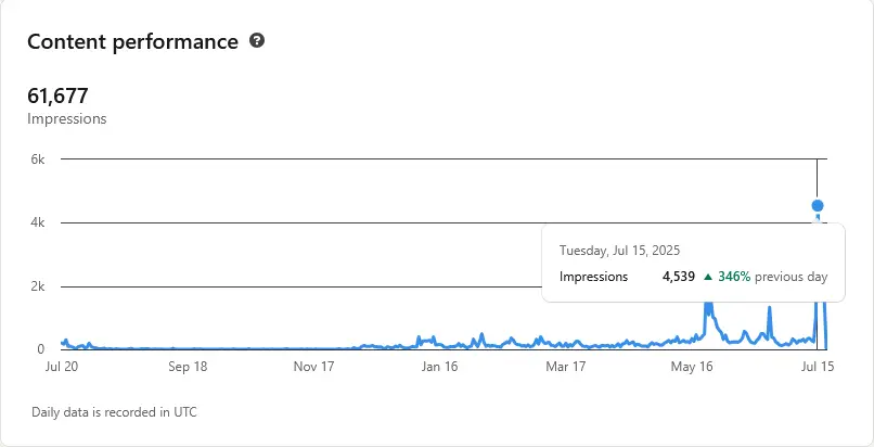
Image 6: Tuesday, July 15 – 4539 impressions.
What 179 Days of LinkedIn Impressions Reveal About Content Momentum and Growth
How a Daily Process Behavior Chart Uncovered a Turning Point in LinkedIn Strategy
Over a 179-day period, from December 10, 2024 to June 6, 2025, I closely tracked the impressions from my daily LinkedIn posts. To analyze this data, I used XmR process behavior charts—a powerful visual tool that helps distinguish normal fluctuations from meaningful shifts in performance.
Here’s what I found.
The Power of Statistical Process Control Charts
Most people evaluate their LinkedIn performance based on occasional spikes or low-performing posts. But this approach misses the big picture. Process behavior charts (also called XmR charts) help you determine:
- What is normal variation?
- What is a signal worth investigating?
- When a real process shift has occurred.
Using these charts, I compared two datasets:
- 167 Days of data (through May 25, 2025)
- 179 Days of data (through June 6, 2025)
Key Metrics: Before and After Adding 12 Days
| Metric | 167 Days | 179 Days |
|---|---|---|
| Mean (Center Line) | 185.74 | 205.49 |
| Standard Deviation (σ) | 67.55 | 71.48 |
| Upper Control Limit (UCL) | 388.39 | 419.93 |
| Lower Control Limit (LCL) | -16.92 (capped at 0) | -8.95 (capped at 0) |
| Points Beyond Limits | 11 | 12 |
| Rule Violations (Patterns) | 61 | 71 |
Adding just 12 more days didn’t just expand the timeline—it exposed a shift.
What Changed?
- Sustained Spike in Late May
A series of posts from May 22–25 significantly exceeded control limits, pushing daily impressions above 2,000. These outliers were not isolated but appeared as part of a run, signaling more than a one-off viral moment. - Elevated Baseline
The mean impressions per post rose from 185 to 205, suggesting a lasting improvement in visibility. - Increased Rule Violations
The jump in “non-random patterns” (from 61 to 71) indicates structural change in performance behavior. This is often tied to improved strategy or audience engagement.
What This Means for Content Strategy
By combining daily discipline with clear data interpretation, I identified a pivotal moment in my content strategy. The data confirmed:
- My visibility on LinkedIn wasn’t just growing—it had turned a corner.
- Specific posts in May catalyzed this shift.
- A repeatable formula might be hiding in plain sight.
Lessons You Can Apply
- Track daily metrics over time: One-off wins don’t show trends. You need continuity.
- Use process behavior charts: They help you stop guessing and start knowing.
- Identify and replicate breakthrough content: Your best-performing posts may hold a pattern worth repeating.
Next Steps
I’m currently analyzing the content themes, post formats, and timing of those late-May spikes. The goal is to build a content framework that scales results—not just once, but consistently.
If you’re serious about understanding what really drives your LinkedIn growth, it’s time to move beyond likes and look at signals. Want help creating your own behavior chart? Reach out. I’m building something for people like you.
Simple Diagnostic Chart Story Part I: here