This is a living document that will updated often.
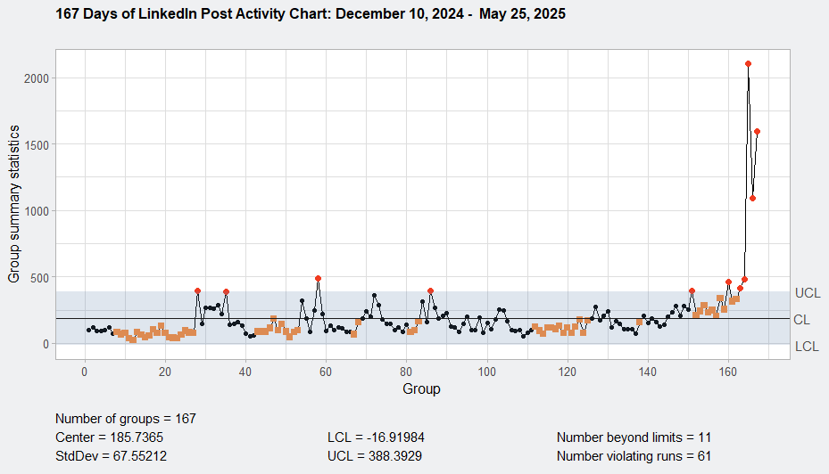
Image 1: XmR chart of my LinkedIn impression data. Click to enlarge.
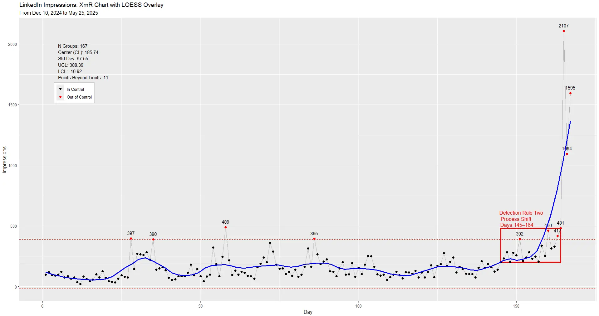
Image 2: XmR chart LinkedIn impressions data with LOESS overlay. Click to enlarge.
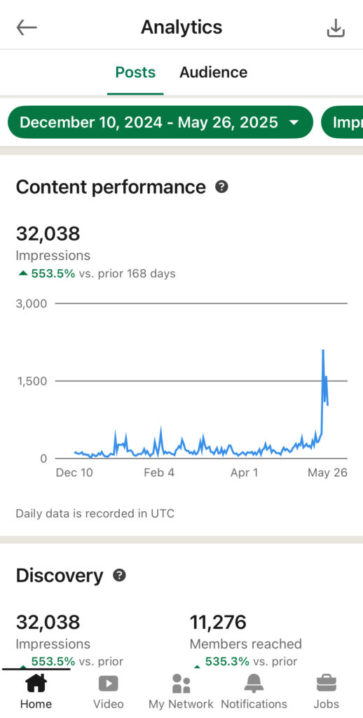
On December 10, 2024, I restarted my LinkedIn journey with intention. My first post that day earned 100 views—modest, but meaningful. From that moment on, I made a promise to myself: show up every day.
I kept that promise for 185 consecutive days. During that time, I didn’t just track how I felt about each post—I tracked the numbers.
The average daily post view count across this period was about 211. Results fluctuated—some days were low, others jumped. But it wasn’t until I applied a XmR chart that I began to see the real story.
At first, my posts hovered below the average. Then momentum started building—posts began consistently performing better. I didn’t guess why. I could see it.
On May 23, 2025, a post hit 2,107 views—my highest yet. But it wasn’t just a lucky spike. Starting May 14, I saw eight posts in a row above the average—a statistical signal that the process itself had shifted.
This wasn’t a fluke. It was the result of steady iteration, guided by feedback from the data. After that shift, 37 of the next 40 posts stayed above the old average. Not by chance—by design.
And here’s what you have to understand: I don’t control the LinkedIn algorithm. That’s about as random as it gets. But I was still able to detect meaningful signals in the noise.
Now imagine this is your business.
Guess who controls how things work in your business?
You do.
If you want better outcomes—more leads, more revenue, higher customer retention—you can’t just stare at dashboards and hope. Most dashboards compare one point in time to another, without showing whether your system is in control or out of control. That leaves you reacting to every dip or spike, with no sense of whether action is needed.
But with an XmR chart, you can:
- Track the process that leads to the outcome
- Spot when the process has truly changed
- Know when to act—and when to leave things alone
Let’s say your goal is to acquire more customers.
How are you doing that now?
How are you tracking it?
What if you took that metric—say, number of inquiries per day—and plotted it over time?
You’d begin to see whether your process is stable, or shifting. And if you spot a true signal, you can go in and tweak, remove, or add steps to improve the customer acquisition process itself.
That’s not just measurement. That’s a feedback loop—and it’s how you build sustainable, bottom-line improvements.
So if you’re ready to move from reacting to reflecting, and from tracking to truly improving, I can help. I work with businesses to apply this exact thinking—so they can act with clarity, make changes that stick, and grow what matters.
Let the process speak. Then act on what it says.
Data
Monitoring Period: December 10, 2024 – May 25, 2025
Total Observations: 167 consecutive daily data points
Subject: LinkedIn Activity – Lindsay Alston
Focus Period: Day 152 onward (May 10–25, 2025)
Overview
This analysis reviews LinkedIn activity over a continuous 167-day period using a XmR chart. From Day 1 (December 10, 2024) through Day 151 (May 9, 2025), the process exhibited expected variation centered around a stable mean. However, beginning on Day 152 (May 10, 2025), the behavior pattern shifts dramatically.
XmR Chart Parameters
- Center Line (CL): 185.74
- Standard Deviation (σ): 67.55
- Upper Control Limit (UCL): 388.39
- Lower Control Limit (LCL): Truncated at 0 (computed as -16.92)
- Total Points Out of Control: 11
Detection Rule Evaluation
Rule 1: Points Outside the Limits
“A single point outside the computed limits should be taken as a signal of the presence of an assignable cause with a dominant effect.”
- Finding: 11 individual data points fall above the UCL.
- Interpretation: Indicates dominant assignable causes — statistically significant and not due to common variation.
Rule 2: Runs About the Central Line
“Eight successive values on the same side of the central line indicate a weak but sustained assignable cause.”
- Finding: A sequence of 15+ consecutive points above the center line is observed beginning May 10, 2025.
- Interpretation: Strong evidence of a sustained process shift, even if within control limits.
Rule 3: Runs Near the Limits
“Three out of four successive values in the upper 25% or lower 25% of the region between the limits suggest a moderate but sustained assignable cause.”
- Finding: Multiple instances where three of four consecutive points fall in the upper 25% band between CL and UCL.
- Interpretation: Confirms directional trend pressure in process output.
Rule 4: Runs Beyond Two-Sigma
“Two out of three successive values more than two-sigma from the central line indicate a moderate but sustained assignable cause.”
- Finding: Several patterns from May 10 onward meet this criterion, with values above the +2σ threshold but below the UCL.
- Interpretation: Supports the presence of a real and consistent upward shift.
Rule 5: Runs Beyond One-Sigma
“Four out of five successive values beyond one-sigma from the central line may indicate a moderate but sustained assignable cause.”
- Finding: Multiple examples post-May 10 where four of five points exceed the +1σ level.
- Interpretation: Additional evidence of systemic change, not random fluctuation.
Summary of Findings
| Detection Rule | Violated? | Type of Signal Detected |
|---|---|---|
| Rule 1 – Outside Limits | Yes | Dominant assignable cause |
| Rule 2 – Run Above CL | Yes | Weak but sustained shift |
| Rule 3 – Near Limits | Yes | Moderate directional trend |
| Rule 4 – Beyond 2σ | Yes | Moderate but sustained change |
| Rule 5 – Beyond 1σ | Yes | Sustained, moderate deviation from the baseline |
5. Conclusion
All five detection rules indicate the presence of assignable causes beginning on Day 152 (May 10, 2025). This suggests a statistically significant shift in system behavior that cannot be attributed to random variation. The magnitude and duration of this change support the conclusion that a new behavioral process is emerging.
Further investigation is warranted to identify the root cause of this shift — whether strategic, external, or algorithmic in nature — and to determine whether control limits should be re-established based on the new process behavior.
Simple Diagnostic Chart Story Part II: here